Senior Community Platform Landing Page Design for Boomer – Germany
Senior Community Platform Landing Page Design for Boomer – Germany
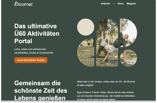
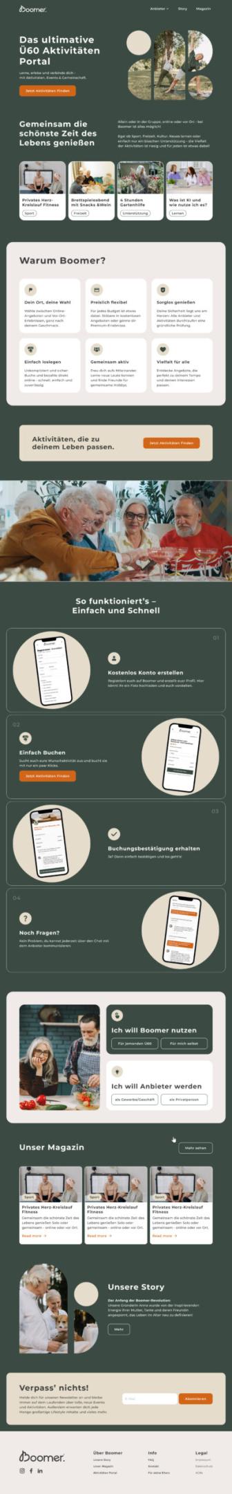
Senior community platform landing page design for Boomer required a deeply thoughtful approach — building a digital experience that could make technology feel welcoming, simple, and genuinely useful to Germany’s 60+ community. Boomer is a Germany-based platform dedicated to helping older adults stay active, connected, and engaged — offering a curated range of activities, events, and social opportunities specifically designed for seniors who want to keep learning, socializing, and living life to the fullest. The challenge was creating a landing page that felt modern and credible to younger family members and partners, while remaining effortlessly navigable for seniors who may have limited experience with digital platforms.
About Boomer
Boomer is built around a powerful and deeply human mission — ensuring that adults over 60 in Germany have easy access to the activities, social connections, and experiences that keep them active and fulfilled. In a digital landscape that often overlooks or overwhelms older users, Boomer offers something different: a platform designed from the ground up with the needs, preferences, and comfort levels of seniors at the center of every decision. From activity discovery and event booking to community connection, Boomer makes it simple for the 60+ generation to engage with the world around them on their own terms.
The Challenge
Designing for a senior audience presents a unique set of UX and design challenges that go far beyond standard landing page best practices. Many members of Boomer’s target audience are less familiar with digital interfaces, which means that design decisions taken for granted with younger audiences — small text, complex navigation, subtle CTAs — can become significant barriers that prevent engagement entirely. The landing page needed to be genuinely accessible: large, readable typography, intuitive navigation, clear visual hierarchy, and calls to action that were impossible to miss or misunderstand.
At the same time, the page needed to feel modern and trustworthy — not condescendi