Talent Marketplace Homepage Design for Yoda – Brands & Creator Economy Platform
Talent Marketplace Homepage Design for Yoda – Brands & Creator Economy Platform
Talent marketplace homepage design for Yoda was a strategic UI/UX project for a fast-growing platform connecting brands with artists and influencers in the creator economy. Yoda needed a homepage that could simultaneously speak to two very different audiences — talent seekers looking for verified, high-quality creatives, and artists and influencers looking for a platform that understood their value and made connecting with brands effortless. The challenge was designing a single homepage experience that communicated Yoda’s marketplace mechanics clearly, established platform trust from the first scroll, and set the foundation for scalable UI components that could grow with the product.
About Yoda
Yoda is a talent marketplace platform built for the creator economy — connecting brands with a curated network of artists, influencers, and creative talent across industries. In a crowded creator economy where both brands and creatives have an overwhelming number of platforms to choose from, Yoda’s differentiated approach centered on quality, trust, and seamless marketplace interaction. Their platform needed a homepage design that reflected that positioning — modern, credible, and immediately compelling to both sides of the marketplace.
The Challenge
Designing a homepage for a two-sided marketplace comes with a unique set of UX and conversion challenges. Yoda’s homepage needed to speak authentically and compellingly to two distinct user groups simultaneously — brands evaluating whether Yoda’s talent network was worth their marketing investment, and creative talent assessing whether the platform was credible, fair, and worth joining. Each group had different questions, different trust concerns, and different motivations — and the homepage needed to address all of them within a single, cohesive scrolling experience.
Beyond the dual-audience challenge, the design needed to communicate Yoda’s marketplace mechanics clearly — helping new visitors quickly understand how the platform worked, what made it different from other creator economy tools, and what the onboarding journey looked like for both brands and talent. Without that clarity, even interested visitors would bounce rather than sign up. Every section needed to reduce friction, build confidence, and move both audience types closer to taking action.
Our Solution
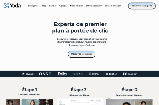
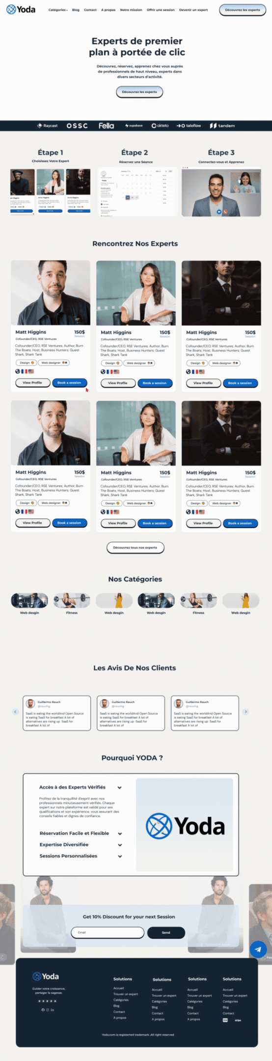
We designed a clean, strategically structured talent marketplace homepage in Figma — rooted in user psychology, platform trust principles, and the specific behavioral patterns of both brand decision-makers and creative professionals. The layout was built to guide both audience types through a clear, intuitive information journey — from value proposition and marketplace mechanics through to talent showcase, social proof, and seamless onboarding flow.
Key marketplace interactions were highlighted throughout the homepage — showing brands how easily they could discover and connect with top creative talent, and showing artists how the platform’s structure gave their work the visibility and commercial opportunities it deserved. A curated talent showcase section was designed to immediately communicate the quality and diversity of Yoda’s creative network — building desire for brands and social proof for new talent considering joining the platform.
Testimonials, category browsing sections, and a frictionless onboarding flow were integrated to address trust objections and reduce sign-up barriers for both user groups. The design system was built with scalability at its core — e